Did you know that the human eye can distinguish 10 million colors? That’s quite impressive, isn’t it? Many centuries ago, color helped ancient people to distinguish and identify information, but now humanity has learned to use it for various purposes.
Walking down the street, we see logos, and bright signs marketers create to attract customers. Driving a car, we pay attention to road signs that inform us and organize traffic, meeting passers-by, we notice their color of clothes, which can tell a lot about a person. Knowing the principles and functions of color helps us visualize information in better and more effective ways, and now you will ensure it. Still, first, let us figure out how human perception works!
The Main Factors Of Color Perception
Color always represents some information, but how we perceive it depends on four main factors. Physiology, emotional state, personal associations, and cultural layering can influence our feelings and overall impression of what is seen.
When we talk about physiology, it is meant that people may have different brain features and eye structures. Retinal cells are located at the back of the eye and function as light receptors, and they play a key role in the color, focus, and brightness of our vision. That’s why some people can distinguish shades that others do not see.
Emotional state
Different emotions can make us perceive information in a particular way that is consistent with the emotion being experienced. For example, this feature is used when the lights are turned off in the cinema before the start of the film, thereby forcing the viewer to cross the barrier between one space to another or from one state of perception to another. This helps to tune in and focus.
Cultural Layering
Depending on the way of life determined by our nationality and place of residence, we may have a certain idea about the symbolism and meaning of colors. What do you associate with green? Green is considered healthy and endurance; this color relaxes the nervous system and soothes the eyes. In Western cultures, it symbolizes youth, growth, and freshness. And oddly enough, in Anglo-Saxon countries, green means greed, ambition, and prestige – after all, it is the color of the dollar. In China, green is betrayal and exile, while in India, it is closely associated with Islam. In Ireland, green is the color of leprechauns and is associated with the four-leaf clover. Green in America is security, while in France, it symbolizes crime.
Personal associations
Refers to personal experiences throughout our lives. Everything we go through may awaken some feelings and memories, both intentionally and unintentionally. We all have different life experiences, so it is not surprising that there are colors with which we associate ourselves and attract us, and vice versa, colors that trigger and irritate us.
Color And Its Components
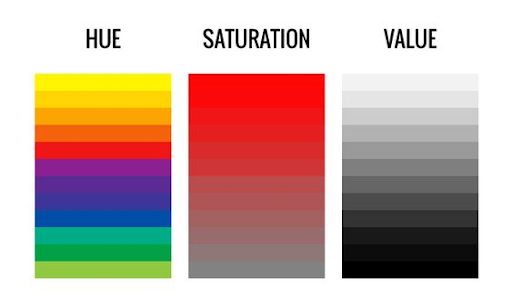
It is worth understanding the basic theory to understand better the meaning of colors and their role in movies. Nowadays, it is generally accepted that color has three components: hue, value, and chroma.
Hue is the first thing that comes to mind when we think of color. We can see it in the six-color scheme. Generally, it depends on the spectral composition of a color’s wavelength that creates the tone of red, blue, yellow, etc.
Saturation indicates the intensity of the color. The color can be pale or faded if the saturation is low or, on the contrary, pure when the saturation is high. It all depends on the amount of white.
Value – refers to the strengths of a color. There is no presence of gray or white in high chroma colors.
Psychology of Color in Cartoons
Animation development has come a long way, from black and white silent frames to bright, three-dimensional images with stereo sound. Modern animation allows the viewer to get a lot of emotions and impressions. Artists use a variety of techniques to evoke empathy and demonstrate character traits.
Of course, our perceptions and associations are closely related to our lifestyles. Still, a well-known theory says that black, gray, and blue shades are associated with sadness, melancholy, and loneliness. In contrast, warm orange, red and yellow are associated with coziness, happiness, and peace.
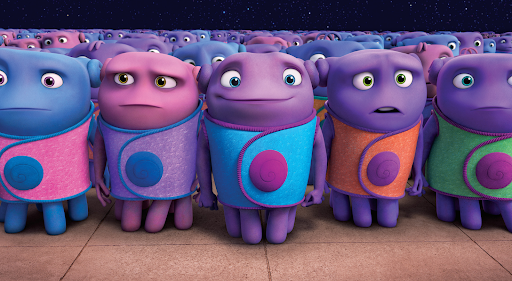
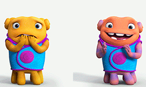
Let’s remember the cartoon “Home,” the main characters changed colors according to different emotional states. When they were sad, their skin turned blue. When they cheated – green and pink meant love, orange – happiness, and purple – neutral. Such a simple but genius trick helps convey the mood quickly, even without words and movements.
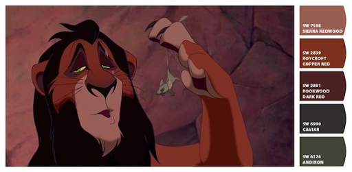
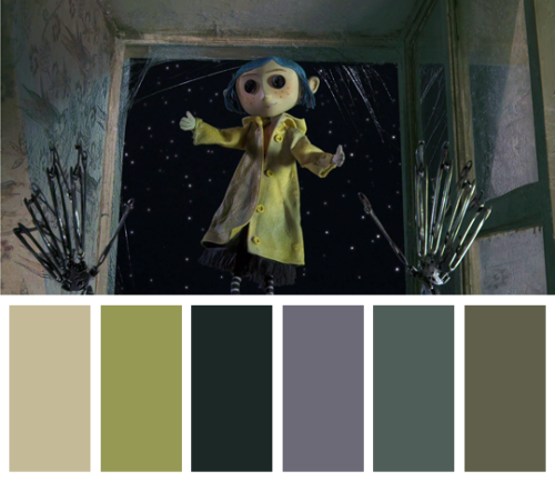
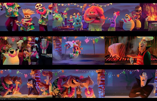
Talking about the properties of color, it is worth understanding that there are techniques that are not obvious at first glance but which have a major impact on the attitude and understanding of the picture. When it is not necessary to highlight good and evil, we emphasize positive and negative character traits. By choosing certain colors for the hero’s image, we give clues to the viewer. Looking at these shots, we can see that the color schemes are similar, as dark, cold, and muted tones are used for negative characters.
The Importance of color
Color symbolism is not a linear transfer of information. Using color in storyboards, the author defines the theme, aesthetics, and overall color palette. By connecting the events, the mood of the location, and the characters with the colors, we ask ourselves what the viewer should feel when watching and what emotions and impressions these things will cause. In this way, we ensure a deep connection with the audience. By adjusting the brightness, tone, and saturation, we can emphasize the central moments, but by adding details such as lighting, clarity, or blur, we make it more unique and diverse.
So, color is an important part of storytelling; if you want to use it correctly, it is important to understand the symbolism, know the techniques, practice the analysis of interpretation and know the basic theory of color. Once we’ve got that figured out, it’s time to put it all into action and color your own story!


