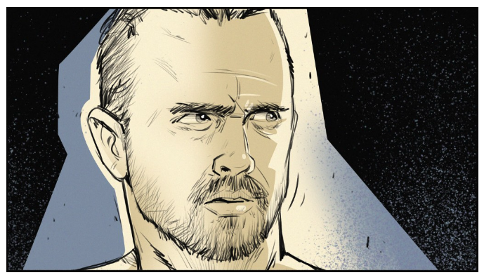
Creating a storyboard portfolio is crucial for showcasing your skills and landing jobs in the competitive storyboard industry. However, building a portfolio that truly stands out requires more than just compiling your best work. Here are some common mistakes to avoid to ensure your storyboard portfolio is both professional and compelling.
Lack of Clarity
Clarity is paramount in storyboarding. Each panel should clearly convey the story, emotions, and actions without confusing the viewer. Avoid cluttered compositions and make sure every panel is easy to understand. Clear visuals are critical for effective storytelling.
- Tip: Use different line weights to distinguish between important and background elements.
- Actionable Advice: Keep a checklist of critical elements to ensure each panel maintains clarity.
“Clarity is key in storyboarding. Every panel should tell a part of the story effectively without leaving any room for confusion,” says Jane Doe, a senior storyboard artist at Pixar.

Breaking Continuity
Maintaining continuity in your storyboard is essential. Ensure that characters, props, and backgrounds remain consistent throughout the sequence. Any changes must be intentional and clear to the viewer to avoid disrupting the narrative flow.
- Tip: Use a continuity sheet to keep track of characters, props, and background details.
- Actionable Advice: Review your sequences regularly to ensure you maintain consistency.
Overly Complex or Incomplete Sequences
Your portfolio should feature complete sequences with a clear beginning, middle, and end. Avoid overly complex stories that are hard to follow and sequences that feel incomplete.
- Tip: Use thumbnails to outline and test your sequences before finalizing them.
- Actionable Advice: Start with simpler narratives and gradually move to more complex ones as you become more comfortable.
Ignoring the 180-Degree Rule
Staging inconsistency, such as breaking the 180-degree rule, can confuse the viewer. Keep the camera on one side of an imaginary line between characters to maintain spatial orientation.
- Tip: Draw a line on your storyboard to remind yourself of the 180-degree axis.
- Actionable Advice: Practice with simple scenes to master the 180-degree rule before moving on to more complex setups.
Lack of Variety
Showcase your versatility by including different genres and styles, such as action, comedy, and drama. Demonstrating your adaptability to various production needs will make your portfolio more impressive to potential employers.
- Tip: Experiment with different genres and styles in your personal projects.
- Actionable Advice: Curate your portfolio to include at least two different genres and styles.
Poor Presentation
A sloppy presentation can detract from the quality of your work. Ensure your portfolio is well-organized, featuring high-quality scans or prints of your storyboards.
- Tip: Use high-quality paper and professional-grade scanning equipment.
- Actionable Advice: Regularly update the presentation of your portfolio to keep it looking fresh and professional.
Too Much Text
While some description is necessary, avoid overloading your panels with text.
- Tip: Use annotations sparingly and only when absolutely necessary.
- Actionable Advice: Focus on letting the visuals drive the narrative.

Repetitive or Similar Panels
Avoid including multiple panels that show the same action from slightly different angles.
- Tip: Each panel should advance the story in a meaningful way.
- Actionable Advice: Regularly review your sequences for redundancy.
Unpolished Work
Only include your best work.
- Tip: Seek feedback from experienced peers before finalizing your portfolio.
- Actionable Advice: Regularly purge your portfolio of outdated or subpar work.
Lack of Thumbnails
Thumbnails are essential for planning your sequences.
- Tip: Create multiple thumbnail sketches to explore different storyboarding ideas.
- Actionable Advice: Include thumbnails in your portfolio to demonstrate your planning and conceptual skills.
By avoiding these common mistakes, you can create a strong, professional storyboard portfolio that effectively showcases your skills and increases your chances of landing a job in the industry.
Tools and Techniques:
Using tools like Storyboard Pro and Photoshop can help streamline your storyboard creation process. Consider learning 3D storyboard techniques; they are becoming increasingly popular in the industry.

Why a Strong Portfolio Matters
A well-crafted portfolio is more than just a collection of your work; it’s a representation of your ability to tell compelling stories through visuals. Potential employers want to see that you can maintain clarity, continuity, and creativity across various projects.
At Storyboard Artists, we understand the importance of a standout portfolio. Whether you’re an experienced storyboard artist or just starting, avoiding these common pitfalls will help you present your work in the best light.
Keep refining your skills, stay updated with industry trends, and always strive to improve. With a carefully curated portfolio, you’re on your way to making a mark in the storyboard industry.
Further Reading
Remember to keep refining your skills, stay updated with industry trends, and always strive to improve. With a carefully curated portfolio, you’re on your way to making a mark in the storyboard industry.


